Most podcasts slap a microphone on their logo and call it a day.
We didn’t.
Every element in the Unfiltered Room HQ visual identity was built with a specific intent — not aesthetic preference. Here’s the thinking behind it.

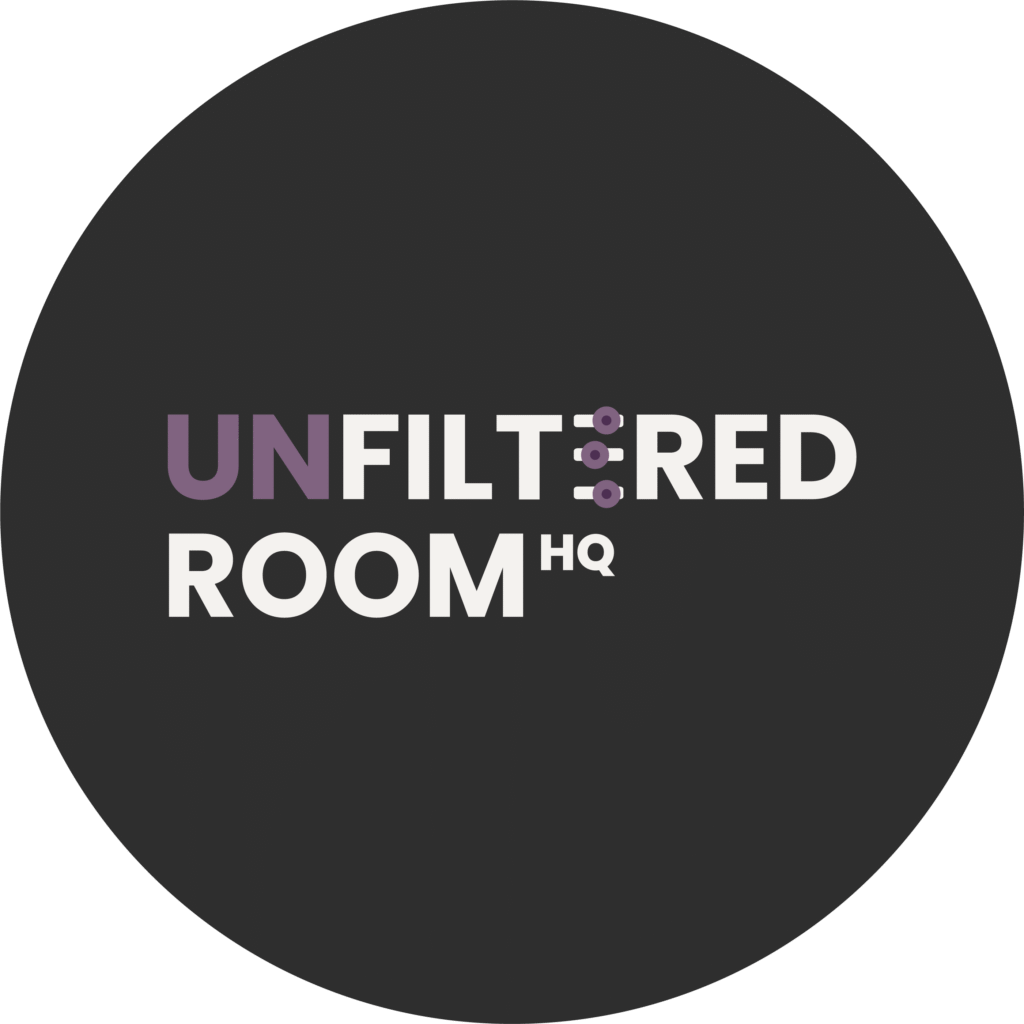
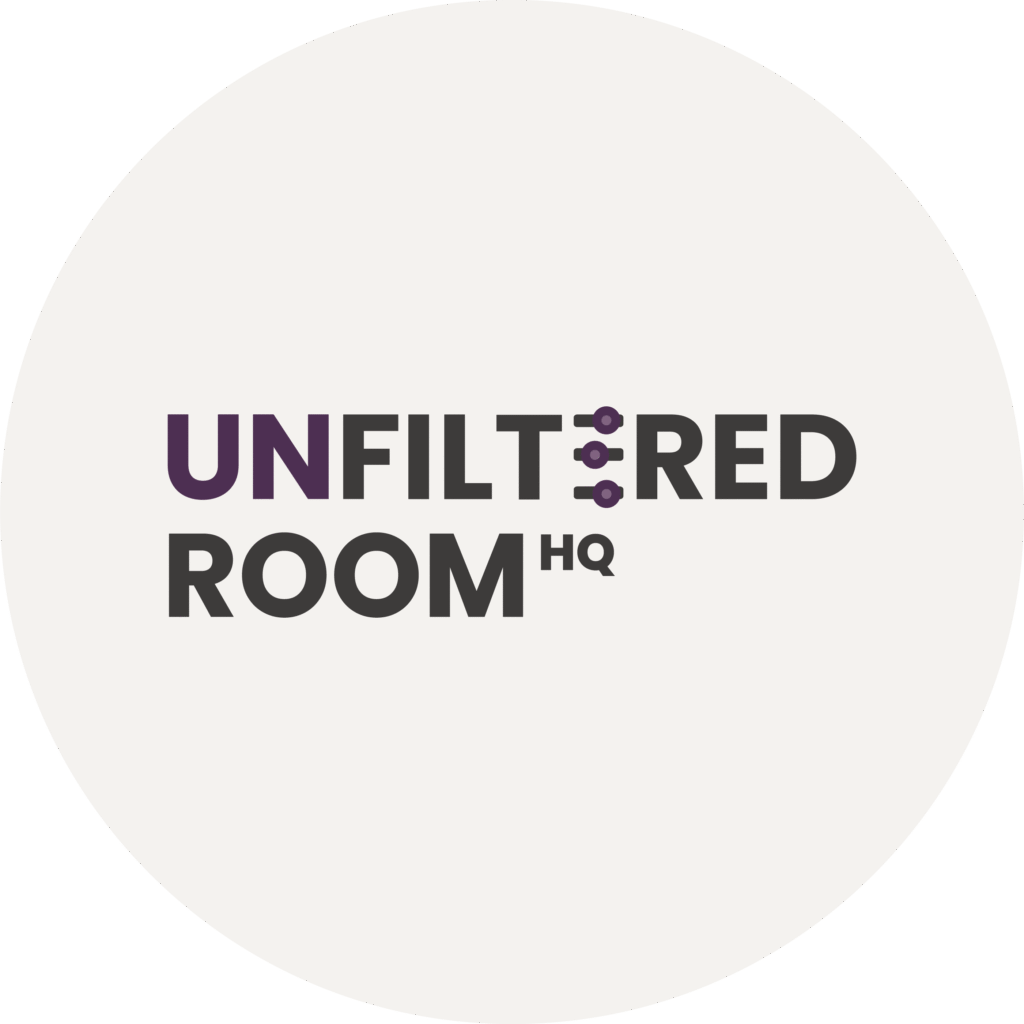
The Icon: Three Knobs, One Statement
The icon is a three sliders like an audio filter. The kind you find on an equaliser, a mixing board, a production suite.
It’s not decorative.
In audio production, a filter is what you use to strip out what you don’t need — frequency noise, distortion, interference — so the signal comes through clean and clear. You’re not changing the source. You’re removing what’s in the way.
That is the entire philosophy of this platform.
We’re not here to clean people up, sanitise their stories, or make their answers camera-ready. We’re here to strip out the performance — the rehearsed answers, the personal branding speak, the “I’m so grateful for this opportunity” energy — so what comes through is the actual signal. The real perspective. The unedited thinking.
The filter doesn’t soften. It sharpens.

Why It Sits Inside the Word “Filtered” — Not Next to It
Look at the logo again.
The filter icon doesn’t sit beside the name. It replaces the letter “E” in “FILTERED.” It’s embedded in the word itself.
That’s not accidental. That’s structural.
The word is literally broken by the icon. Which is exactly what the brand does to conversation — it interrupts the polished flow, inserts something real in the middle, and makes you look twice.
Most logos treat the icon and the wordmark as separate elements. We made them the same thing. The icon is the idea. The name is the proof.
The Typography: No Softness, No Apology
The typeface is heavy, full-weight, unapologetically bold. No serifs trying to look refined. No thin letters trying to feel premium.
It reads exactly the way the brand sounds: direct, grounded, takes up the space it needs.
“HQ” sits small and sharp after “ROOM” — not as a suffix, but as a signal. HQ means this is the centre of operations. Not one room. The house. The source.
That detail separates Unfiltered Room HQ from a single podcast. It signals a network, a platform, a property — with rooms that serve different purposes under one roof.
The Colour System: Purple Leads, Dark Anchors
The purple on “UN” isn’t accent colour. It’s the tension point.
“UN” is the prefix that changes everything. Without it, it’s just “Filtered Room.” With it, the entire meaning flips. Highlighting only those two letters in purple is a way of saying: this one word is doing all the work.
The dark charcoal used across the rest of the wordmark isn’t black. It’s not trying to be dramatic. It’s grounded — the kind of serious that doesn’t perform seriousness.
Two logo versions exist for a reason. Light background for professional contexts, editorial use, and content where the brand needs to breathe. Dark background for digital-first environments, thumbnails, and any situation where the brand needs to hold weight against busy visuals.
Neither is the “default.” Both are primary. The context decides.
What the Logo Is Actually Doing Commercially
Here’s the part most people don’t think about when they talk about logos.
This logo has to work across Spotify covers, YouTube thumbnails, TikTok frames, IG profile icons, website headers, sponsorship decks, and guest media kits. At 16px and at 1600px. On beige, on black, on someone’s phone screen at 6am.
The icon alone — the three filter knobs — is recognisable enough to function as a standalone mark. No wordmark needed once the brand is built. That’s a long-game decision built into the design from day one.
The boldness isn’t about attitude. It’s about legibility at scale.
The Honest Take
There are tens of thousands of podcasts live right now. The logo can’t save a bad product. But a logo that knows exactly what it is — and why every element is there — signals that the people behind it are building something intentional.
Unfiltered Room HQ isn’t trying to look like a podcast. It’s building a platform that happens to use audio and video as the medium.
The filter icon isn’t branding.
It’s a position.
Unfiltered Room HQ is a content platform under Getsubstance.co Pte. Ltd., designed for real conversations that don’t get sanitised before they reach you.